It started with some colored pencils.
A little girl said her favorite color was pink. Her dad said he could prove her wrong. He took all her colored pencils and lined them up by length. The result was obvious: her most-used colored pencil was blue, not pink. It’s hard to argue with the data.
This got me thinking. What other kinds of answers can we find by looking at data that appears in the real world as a byproduct of what has been “used up” or “worn down”? What can we tell from what’s left over?

Quite a lot, it turns out. Rebecca Saltzman, a director of the Bay Area Rapid Transit, recently shared an image of rail spikes pulled from the BART tracks. Compared to the new one in the center, the old, rusted spikes look dangerously worn away. This display of visual evidence – an inadvertent bar chart – makes one thing extremely clear: BART is in dire need of repair.
Visual of BART aging infrastructure - rail spikes pulled from tracks last year, new one in middle. #ThisIsOurRealitypic.twitter.com/XYgw2A4rBE
— Rebecca Saltzman (@RebeccaForBART) March 18, 2016
If you’ve ever ventured out of the house in the few hours or days after a huge snow storm, you’ve likely noticed something different about street corners. Namely, that they are covered in inches of snow. Despite snow plows’ best efforts, these mountains of snow build up over days and can stick out many feet from the curb. And this leftover snow can actually reveal valuable information: the places where cars don’t drive.

By narrowing the streets and extending the sidewalks, the buildup of snow creates a temporary “neckdown”, an urban planning technique for calming traffic. Sidewalk extensions (permanent or snow-created) force cars to slow down as they make a turn, protecting pedestrians and cyclists. And as New York videographer/transportation hobbyist Clarence Eckerson Jr. points out in this video documenting snowy neckdowns (or “sneckdowns”) in the wild, cars seem to have no trouble navigating these much safer turns. Sneckdowns have become so popular that they’ve even got their own hashtag.
Once again, the visual evidence of what’s been used (or in this case, driven over) is valuable data. Leftover snow could provide urban designers, transportation engineers and pedestrian activists with important data to make real world public safety decisions. It could also inspire more creative and less costly ways to build better and safer streets.
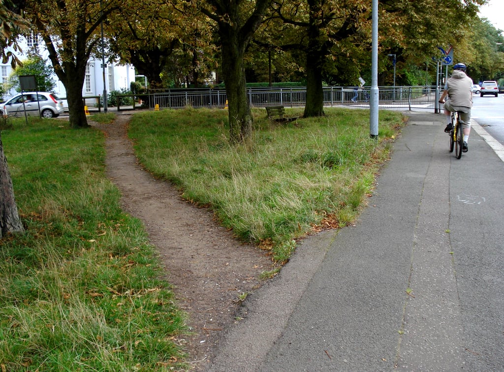
Paths don’t have to emerge out of the snow to be useful, either. “Desire paths” are spontaneous trails that are worn into existence from repeated use (sometimes called “cow paths” or “social trails”). Sometimes these paths are quite literal: stomped shortcuts through a field or visible tracks around an obstacle. Other times the paths are metaphorical, brought up in digital contexts to argue for creating better user experiences.

The expression “paving the cowpaths” is sometimes used to express disdain for blindly going along with what was there before. The go-to historical example is the matrix of convoluted streets in Boston, which make no sense until you learn that they trace the original cowpaths through the city. But the phrase has also come to mean the value in looking at what people actually do and then formalizing those actions, rather than going against the grain of human behavior.
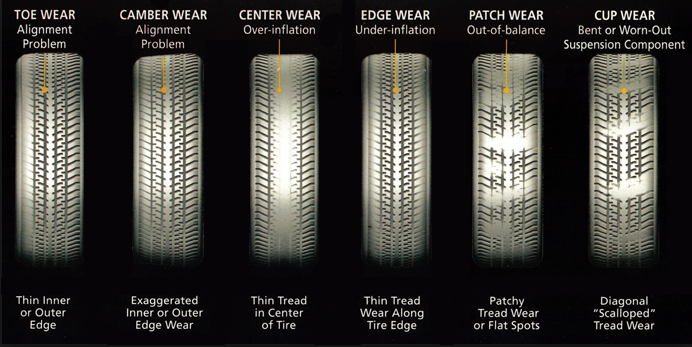
Wear patterns have long provided important indicators to help keep us safe. For example, checking out the wear pattern of your car tire’s tread can help you determine whether your tires are over-inflated, out of balance or misaligned. A garage in upstate New York published a visual guide to the ways the tread on your car tires can wear, and what each pattern may mean:

Runners are often told to inspect the soles of their running shoes to gather clues about how they run. For example, if your right shoe is markedly more worn down than your left, your quirky running form may be setting you up for more injuries. But even symmetrical wear patterns can be revealing. They can show whether you tend to land toe or heel-first, or how far your foot rolls inward (or “pronates”), when you hit the ground.
Coaches, trainers, and physical therapists alike have long drawn connections between certain wear patterns and getting injured (or not). Not surprisingly, so have shoe companies. Pronate too much? You need this motion-control shoe. Not enough? This cushioned shoe is for you. According to the advertisements, the data on the bottom of your shoe will help you find the perfect Cinderella fit.
Now, some small studies do suggest that certain foot-strike tendencies may be more likely to cause injuries or even predict what sort of injuries you’re prone to. But the science is anything but clear on this (and it likely won’t be until we can collect a lot more data).

In other contexts, wear and tear data is just lot easier to collect than setting up fancy experiments or conducting interviews. One classic example is museums using the wear and tear on the floor tiles in front of art exhibits to measure their popularity. Another option is counting noseprints on the glass fronts of exhibits (added bonus: you can indirectly measure the age of visitors from the heights of the smudges). Social science is full of these sorts of “unobtrusive measures.”

Of course there are many other examples out there of data appearing as a real world byproduct of use or wear. Cases where what’s been used up, leftover, missing or accumulated can give us valuable insights or help us make better decisions about health and safety, design, or policy changes.
Or just give us an excuse to turn asphalt into a colorful canvas:
Know of any good examples? Email lena.groeger@propublica.org.


