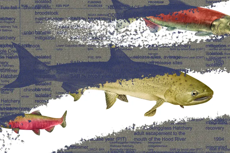
Most of the time, my colleague Irena Hwang works with numbers. An electrical engineer by training, she wrangles impossible data sets into intelligible sentences that word-bound people like me can understand. What she does seems like a kind of intellectual alchemy, drawing solid and valuable facts out of barely visible particles of knowledge.
But this year, as Oregon Public Broadcasting and ProPublica worked to document the extent to which the salmon hatcheries of the Pacific Northwest were failing to sustain fish at healthy levels, another of Irena’s talents emerged. One she had been keeping secret.
Since November, we — by which I mean, she — had been trying to count fish: specifically the large number of salmon released by government-funded hatcheries into the Columbia River to swim down to the Pacific and the much smaller number that completed the hard journey back upstream. Her co-reporter, OPB’s Tony Schick, was finding through interviews that nowhere near enough salmon were surviving. Despite more than a century of promises from the U.S., native tribes were losing access to traditional fishing, and with it their way of life. Counting fish would help us prove that.
The publicly available data and reports from experts measured the flow of fish in myriad ways, and Irena’s analysis goals seemed to shape-shift with every conversation. Irena read hundreds of pages of reports, conducted many hours of interviews with fish scientists and encountered a number of dry riverbeds — data-wise — along the way.
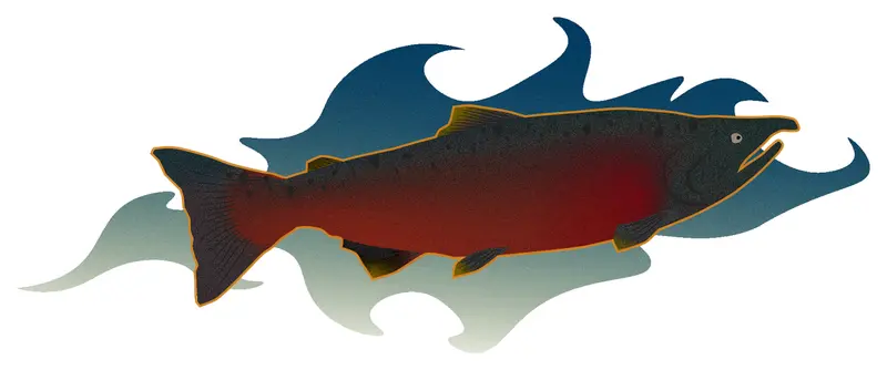
Little did I know, however, that Irena was working on more than the data. In mid-April, at one of our weekly project meetings, she presented a draft of the graphics for the story, including a few icons of fish pulled from the internet, and asked us which style we liked best. I hadn’t really focused on them, but I saw they were very different. One, a digital illustration with hard lines and uniform colors, was almost a caricature. Another looked hand-drawn, with subtle variations in color. We all agreed the more detailed and colorful version was best. In hindsight, Irena was coming very close to tipping her hand, but I didn’t think anything of it at the time.
Irena, however, was thinking. “I did a lot of art when I was a kid,” she told me later, but “when it came time to go to college, I ended up doing highly technical work, and art just fell by the wayside.” She said she occasionally thought about art but felt paralyzed. “I didn’t feel creative enough to be a, quote, true artist.” As she worked her way through an undergraduate, master’s and doctoral degree in electrical engineering, Irena said, she lost the motivation to sketch more than a handful of times each year or to even doodle in the margins of a notebook. She stopped visiting art museums.
Then the fish project rolled around. There was a blank spot where illustrations might go. And she thought that maybe she had been avoiding art because “it was this big open-ended thing”; that maybe it would be easier with some structure. A straightforward assignment — just four anatomically accurate fish! — with a deadline seemed like just the type of contained project that Irena had been looking for. She wrote to one of ProPublica’s visuals editors, Andrea Wise, and shared two older pieces she’d done. Immediately, Andrea said she would love to art direct as Irena created illustrations for the story.
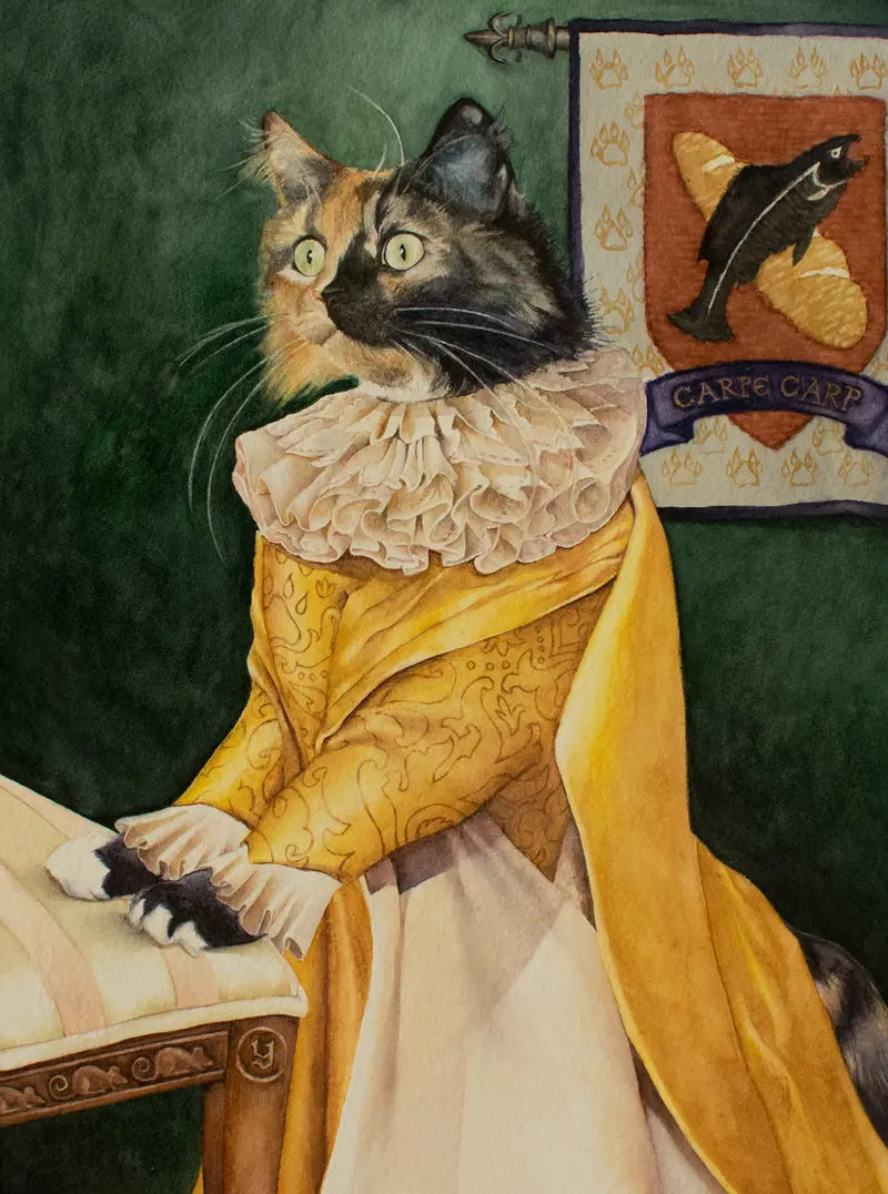
Seen one way, painting and data work are very different. As Irena said, “Coding uses the part of my brain that’s good at planning and breaking complex tasks down into little components. But when I’m painting, I let the other half of my brain take over, the part that seems a little mysterious, squishy and does things because they just feel — and look — right.”
But while that distinction is very real, it’s not the whole picture. In talking with Irena about the four beautiful watercolors she created for this project, I also recognized that she brought to her art the same intensity she brings to her data work every day. She briefly considered creating stylized fish using Adobe Illustrator — it would have been easier — but settled on painting fish that were as accurate as they were beautiful. And painting visually accurate fish for ProPublica meant research, and a lot of it.
As she tried to identify the right source photographs on which to base her work, the variables were almost as endless as with the data she had been analyzing. For one thing, “there’s a lot of sexual dimorphism in fish”; that is, the males and females of a species can look very different. There are also geographic differences: a Chinook in Alaska may mature to a completely different color from a Chinook in Oregon.
On top of that, each fish looks different at different points on its journey, sometimes undergoing dramatic changes as it swims upstream to spawn. Most salmon species are silver in the ocean but erupt in browns, greens and bright reds as they make the freshwater journey to spawning grounds. Chinook, coho and sockeye males can develop a pronounced, hooked upper jaw. Male sockeye grow a prominent hump. And, Irena pointed out to me, fish actually look different in water than they do in hand, held high for the trophy shot. She had built files and folders of fish research. But if she could only represent one image of a coho salmon, which coho salmon would it be?
“There was a lot of really fun nerdery going on,” she admitted. “Among my nightmares was that someone would write in and say this isn’t what a salmon looks like.”
Ultimately, Irena had to make some key decisions she could stand by: She focused on fish as they were returning to spawn, deciding that those brightly colored ones would be more iconically recognizable than their silvery ocean selves. She focused on underwater fish to capture their brilliant colors in their native state. And, finding that many available pictures were of the more brightly colored male fish, she decided, “Yeah, we’re going to feature female fish!”
Certainly it was an artist who created those watercolors for publication. Even Irena seemed to experience it that way. “What I love about watercolor is that it is very transparent. You’re working in layers so every time you add a layer, it’s like you are revealing something that was hidden in the paper all along, waiting for you to bring it out.”
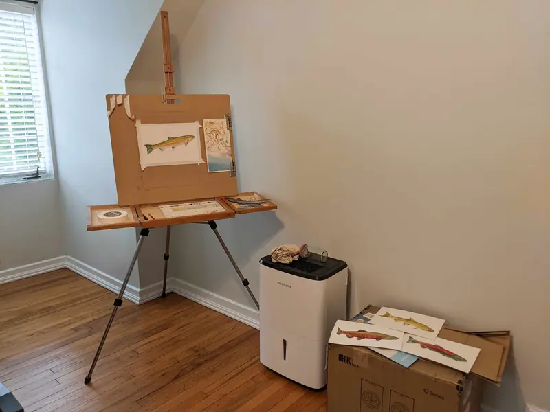
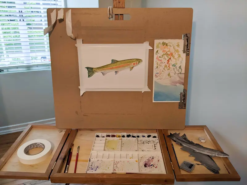
But the engineer in her was not far away. Those images needed fact-checking. Irena needed to know that, even beyond her precise choices, her images had turned out precisely right.
Some of the flaws were obvious: She had forgotten to give the Chinook “something that looks like a nose on a salmon.” We struggled for the technical word. She Googled it. “Nostrils! I had to give it nostrils!”
Some of the flaws were in the eye of the beholder: She sent three of the images over to Tony, her co-reporter, who shared them with his fish-savvy colleagues at OPB. One suggested the jaw of the Chinook should be more hooked. “I’m doing the females,” Irena fired back, putting that issue to rest.
The colors were perhaps the biggest trouble of all. The source image Irena had worked off of for the Chinook was taken in a sunny area of a river, resulting in a fish that was a bit more golden in tone than most anglers might recognize. Photoshop helped bring it into a more recognizable olive-brown tone.
And then there were the total misfires. Irena mentioned that there had been an earlier steelhead painting, entirely different from the one we published. She had struggled with it because mature steelheads have intense colors, but the source image she was working off of was full of colors that Irena worried would combine into a muddy mess. In an attempt to avoid a drab fish, she chose paint colors that emphasized the highlights — and ended up with one that was too bright.
I wanted to see it. So she sent me this message over Slack: “was this even a steelhead? It’s unclear in hindsight.”
She included a little grimacing emoji and then the photo of her earlier painting.
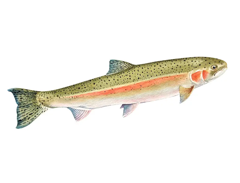
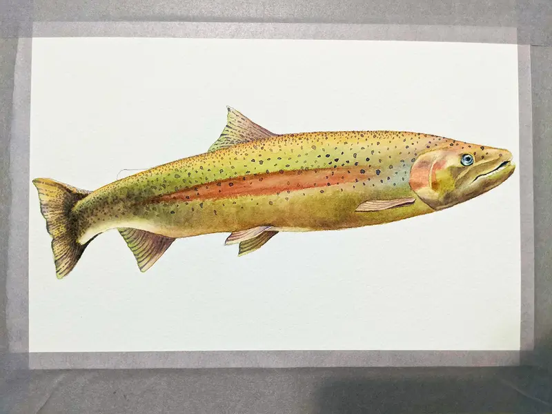
Steelhead or not, I honestly would not have known. As I wrote back to Irena: “It’s very beautiful. Just a different cast of light, in my opinion...”
I asked Irena about painting as a journalist. “It was definitely fun. It was also stressful because I had never painted on deadline,” she said. On the other hand, it was clear there was something to her concept of doing art within structures: Before this, “I walked around thinking I was too much of an engineer to be an artist, and too much of an artist to be an engineer,” she reflected. The fish project seemed to bring those two different sides of her brain closer together. “That’s why I love journalism so much.”
